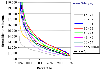
Comparing your income with all tax payers may not be ideal. Wouldn’t it be nice if you can benchmark your monthly salary against people in your age group? Aha, here’s the tool to do it:
Again, I took some data from MOM, this time from Report on Labour Force in Singapore 2006 which was released in January 2007.
What’s good about the aforementioned MOM report is that is that wage data is available in 2 dimensions – age group and wage level. What’s not so good is perhaps the wage data is compiled by a survey – the type which requires respondents to answer questionnaires (as opposed to just getting data from highly trusted sources like CPF and IRAS).
Here’s the graph of gross monthly income against percentile for each age group:


13 Comments
I like this benchmarking tool. It’s interesting to see that my salary will drop by 20 percentile if I move into the next age group, so I guess I need to buck up and earn more.
Not sure if they considered the difference in education level in this survey. Blue collar worker and managers, for example, would have different expectation of pay.
There should be two sets of data – executives & non-executives.
Engineers in MNC are paid more than Managers in local companies. Anyway, I normally ignore comparison with the top 10% as they are the income non-limiting professions, such as traders and brokers.
Hi, I think this graph is really great!!Appreciate the effort there!
Would it be possible if we can have a 2008 version of this? Given the recent salary hikes, would be good if we can have an up-to-date comparison. Hope you’re acceed to the request. Many thanks again for your time!
Pingback: Junior Trader Makes 0k | Salary.sg - Your Salary in Singapore
Not too sure how accurate this benchmark is but most of the people i know or worked with are already way up in the top 5% income earners going by this survey. Somehow i feel that in reality the income level should be higher. If not, how can there be so many people buying up all the private properties despite current price levels??
Keito, funny that some people are commenting these official surveys are painting too rosy a picture (see: http://www.salary.sg/2008/degree-holder-is-your-income-above-the-median/#comments ), and yet some like yourself are saying the reported numbers seem low! 🙂
Well, to try to answer your question, maybe the people buying properties are wealthy foreigners, rich expats, or high-income couples earning >$10,000/mth who borrowed heavily (a loan of $1m repayable over 30 years at 5% pa requires a monthly installment of $5,400 which is not beyond their reach).
useful tool. thanks.
Pingback: Are You Paid Well Enough? (And Why Millionaire Next Door Sucks) « The Curious Schemer
Pingback: Security Guard Makes 4k | Salary.sg - Your Salary in Singapore
Pingback: Compare Your Income by Age & Gender | Salary.sg - Your Salary in Singapore
hi,
im 28 tis year, in media advertising as media director, earning $8,000 / month BASIC.
so in what projectile am i , admin? thks for replying.. 🙂
winston, you can use the calculator above, or the latest one here:
http://www.salary.sg/2008/compare-your-income-by-age-gender/